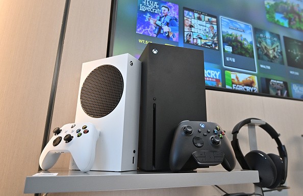
Xbox's new menu design enters its testing phase months ahead Microsoft releases the fresh user interface sometime in 2023.
And now that Microsoft is testing out the new menu for Xbox, we get a glimpse at how the upcoming design would look once it starts rolling out to its console gamers.

Xbox's New Menu Enter Testing Phase
As per the news story by The Verge, the giant console maker is now testing out the new user interface for the Xbox Home.
Microsoft says that it is set to introduce the all-new menu of the Xbox to all of its console users anytime next year or in 2023.
And months before it officially rolls out to all users, Microsoft is experimenting with the new look of the Home UI as it tests out a couple of new changes.
The senior product manager lead of Xbox Experiences, Ivy Krislov, told The Verge that the "Xbox homepage is where our gamers spend the most time. He also notes that it is "a space that's very personal" to its gamers.
And given that, Krislov says that Microsoft is testing out various features of the new menu, noting that the tech giant listens and learns from its users.
He adds that it should help the team behind Xbox to "create a more personalized home screen experience." Not to mention that the new update also seeks to listen to the requests of its fans, along with the latest trends these days.
What's New with the Xbox Home UI
It looks like the new Xbox Home UI is actually closely familiar to users of the Xbox TV app as it resembles the design of the latter, The Verge highlights in its report.

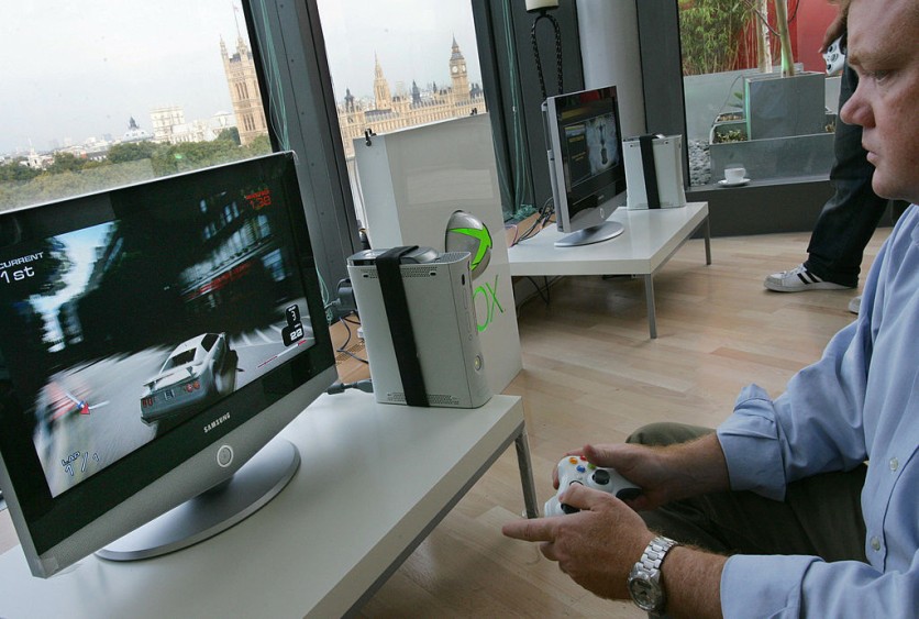
(Photo : ODD ANDERSEN/AFP via Getty Images)
London, UNITED KINGDOM: A gamer maneuvers his car through the streets of London on an Xbox 360 with the houses of parliament in the background as a preview of Microsoft's new game console was shown to the media in London, on 12 October 2005 before it's European launch 02 December 2005.
However, according to a report by Kotaku, the refreshed look of the Xbox menu is not some sort of drastic redesign after all based on the early screenshot of the Home UI that The Verge shared.
The updated design still showcases various tiles that lead its users to gaming titles and other links and menu options.
But what sets the new look apart from the current version is that it looks more vibrant than ever seemingly due to the more colorful look.
Besides the more fresh vibe, The Verge notes that the new version that Microsoft is testing out brings a couple of new options.
For instance, the refreshed design comes with a new "jump back in" option, which features recently played titles and opened apps. And the tiles for these are smaller than other games in the interface.
But it is important to mention that Microsoft is still experimenting with the new design. So we might see a couple of changes along the way.
This article is owned by Tech Times
Written by Teejay Boris


