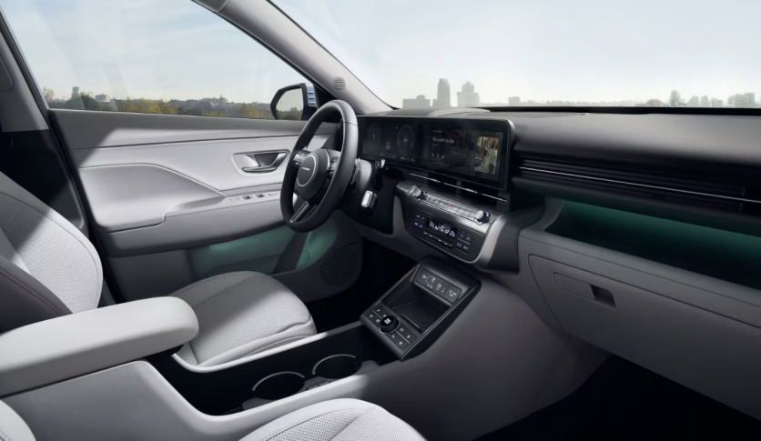
The interiors of cars, particularly as they pertain to the use of electronics, have seen significant transformations throughout time.
Moving away from internal combustion engine (ICE) cars and toward electric vehicles (EVs) has been connected to the demise of many things.
Manufacturers are racing to include larger touchscreens and softer touch controls, leaving conventional buttons and knobs in the dust. Fixed buttons that serve a single purpose are being replaced with broad menus full of programs and configurable settings for each passenger in the vehicle.
However, Hyundai is reportedly fighting the trend toward turning vehicles into fully touchscreen cars. Or at least until their cars are fully autonomous, the firm has no plans to get rid of these buttons.
Why Keep the Traditional Buttons?
The reason? For safety purposes. In a report by PCMag, Hyundai's design director Sang Yup Lee asserts that digital screens demand too many eye movements from the driver to navigate.
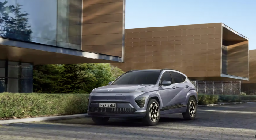
"We have used the physical buttons quite significantly the last few years. For me, the safety-related buttons have to be a hard key [that] is easy to sense and feel," Lee stated during the recent unveiling of the next-generation Hyundai Kona EV.
Lee further stated that until the advent of autonomous driving makes purely touch-based displays safer to deploy, the firm would continue to employ physical dials. This is in addition to touch screens, particularly for operations like controlling the air conditioning and volume.
Screens and touch controls have become ubiquitous in modern vehicles, requiring drivers to divert their attention away from the road as they navigate menus. With conventional buttons or switches, it is simpler and often does not need a driver to take their eyes off the road.
In-car touch displays will make sense once vehicles are approved for Level 4 autonomous driving, but until then, Lee believes it is safest to have your eyes on the road and your hands on the wheel when driving.

Concerns About Safety and Convenience
The desire for buttons may seem like a throwback to a bygone age, but some people seem to share Hyundai's priorities of safety and simplicity.
According to Jalopnik, a Swedish magazine called Vi Bilägare tracked drivers of 11 different vehicles last summer while they completed many activities on the dashboards. When compared to a newer car with plenty of screens, such as the Tesla Model 3 or BMW iX, they said the 17-year-old Volvo was much simpler to operate.
PCMag also documented the same concern. The report said that one time when driving a Tesla EV, it took them several touches on the touchscreen to locate the defogger when the windows fogged up, making it difficult to see the road ahead.

ⓒ 2026 TECHTIMES.com All rights reserved. Do not reproduce without permission.


