Atmajitsinh Gohil, a leading expert in AI-powered data visualization tools, has spent much of his career exploring how technology can tackle some of the world's most critical challenges. He shared his insights on leveraging the power of data to transform healthcare infrastructure and drive financial inclusion for underdeveloped communities.

Atmajitsinh Gohil is recognized among industry leaders, policymakers, and researchers as the author of the R Data Visualization Cookbook, a comprehensive guide to the R programming language. His innovative approach to identifying fraud through AI capabilities has assisted top U.S. banks and other financial institutions in fighting fraud.
Gohil's latest research, however, explores the advances in AI and its benefits in improving financial services in developing economies. He focuses on examining the impact of government policies and financial infrastructure on financial inclusion.
"I looked into the effectiveness of government initiatives aimed at increasing financial inclusion in India," Gohil said. "We gathered data from rural villages to see how government policies, advances in technology like mobile banking and financial literacy programs are reaching those who need them most. My research used machine learning techniques and data visualization to understand the impact of policies and technology on financial inclusion."
Gohil's insights are particularly important given the fact that large portions of rural populations in India and Africa remain unbanked. One of the key findings of his research was the importance of financial education and infrastructure and the role it plays in ensuring that people not only have access to financial tools and banking services but also understand how to use them.
"Financial inclusion isn't just about getting people to open bank accounts—it's about ensuring they can make informed decisions, such as avoiding predatory lenders," he said. "My research suggests that as governments roll out more accessible financial services, they must also educate people about these services and how to use them wisely."
The study used structural equation modeling to visualize how financial inclusion policies interact and which factors are critical for success.
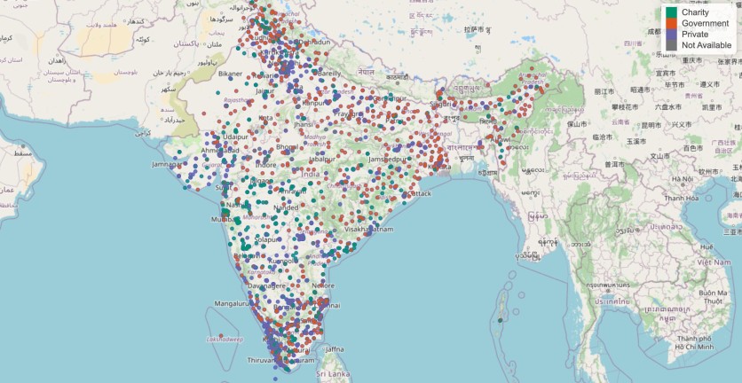
Gohil has also applied his expertise in data visualization to healthcare challenges with a project involving blood banks. By analyzing publicly available data on the locations and operating hours of blood banks across India, Gohil was able to create an interactive map that shows users where blood banks are located and their accessibility.

The project began as a personal interest but gained significant attention after Shiny, a popular platform for building interactive web applications, featured it on their website.
"The interactive map highlights gaps in coverage, helping people in regions with fewer blood banks easily find access points," Gohil said. "The visualization was also demonstrating how government-provided open data can be used to create tools that help solve real-world problems, such as improving healthcare infrastructure."
By making the data easily accessible and interactive, Gohil's project also shows the power of data visualization in improving public health. "You need to be innovative and creative when working with large data sets that are constantly changing," he said, referring to the new types of data emerging in the AI/ML field.
As data continues to grow at an exponential rate, the need for tools to manage, assess, and visualize it becomes more pressing. Gohil's work highlights the critical role of advanced data visualization in driving positive change in healthcare and finance.
"In recent years, the volume of information we're generating has increased significantly," Gohil said. "So, the question is, what do we do with all this data? We need a clear and simple way to present it that makes sense and helps us take meaningful action."
ⓒ 2026 TECHTIMES.com All rights reserved. Do not reproduce without permission.


