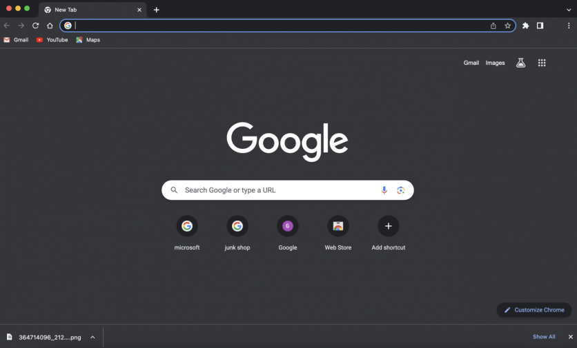
New changes are coming to Chrome's desktop browser thanks to its new UI update that moves the download bar from the bottom to a tray users may access via the window's address bar. Now, get ready to say goodbye to the old Chrome download bar at the bottom as sometimes, accidentally closing this is quite annoying and would require users to go on a separate tab.
The latest UI change signals a revamp of the Chrome experience that centers on looking similar to other browser apps that offer a cohesive display for a user's downloads.
Goodbye Chrome Download Bar at the Bottom

Google brought in a new change for Chrome as detailed in its support article, and it puts the download bar at the bottom to a new "Download Tray" right at the address bar. This changes the experience entirely for users, as Downloads on Chrome are not easily accessible if one closes the bar at the bottom.
Also, some users are annoyed at Chrome's bottom Downloads bar which adjusts the screen size to make way for the downloads.
According to 9to5 Mac, Google had three reasons it gathered from user insights that affected this change. One is how it takes up display space and only features a limited number of downloads seen, it did not go away automatically and only has limited features, and lastly, it does not adhere to Chrome's modern look.
Hello New Chrome Download Tray
That being said, the new Download tray resembles what Safari and Firefox offer to users where its icon is located at the top right part of the address bar and would appear in a drop-down mini window to see its progress.
When closed, it would also show the progress for the latest download, and it would also help categorize the files. Moreover, the new tray would warn if it is a potentially harmful file, especially for .EXE, .PDF., and other downloads in the mix.
Google Chrome's Experience
Throughout the years, Google has updated Chrome to fit users' experience in their needs for a web browsing app that competes with the likes of Safari, Mozilla Firefox, Opera, and more. Among those promised by Google are its impressive browser features including the iconic Memory Saving and Battery Friendly tool that improves the experience.
While some got tired of the default themes and colors of Chrome, Google applied the Material You looks to the browser to refresh what it displays for all.
Still, Google's Chrome is regarded as one of the top browsers of this time, also one with millions of users worldwide.
However, what set Google apart all these years is its download bar at the bottom which makes the screen smaller as it pops up whenever downloading files, and users lose access if closed. Now, the downloads would be easier to access via its icon on the address bar alongside the extensions and plugins, easily accessible at all times.
Read also: Google: WebGPU to Enhance In-Browser Gaming as Default Feature in the Upcoming Chrome 113

ⓒ 2025 TECHTIMES.com All rights reserved. Do not reproduce without permission.


