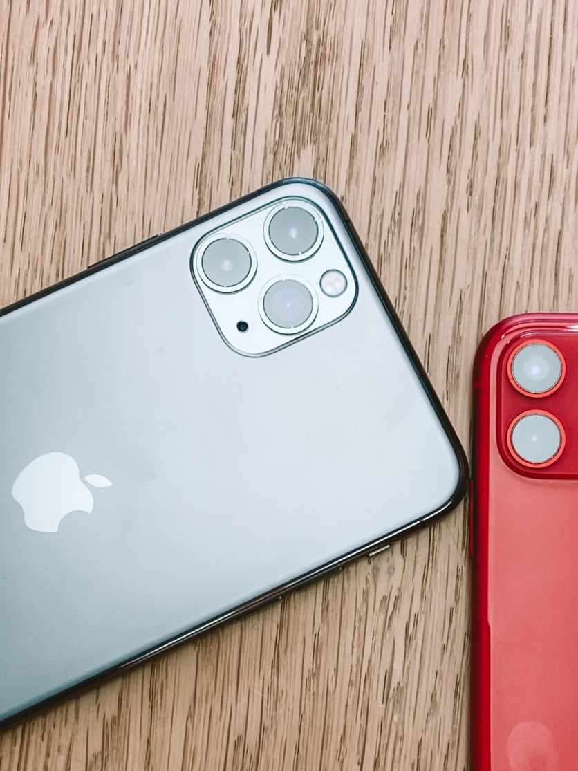
Apple had a great time this past two months, with the release of the iPhone 11 rallying a battle cry for its users around the globe. The new iPhone has put Apple back on the map. With a camera that finally makes Apple great again, and with the A13 Bionic processor, iPhone 11 is a big treat to Apple fans.
But with the release of iPhone 11 also came the release of iOS 13. The iOS 13 is pretty groundbreaking as well, introducing new features and changes that make using Apple devices so much better. But there are two things that they've introduced in this update that is not only head scratching but infuriating as well.
Truly, changes do take some time to accept. But sometimes, some things aren't meant to be changed. Many iPhone users felt that the change was unnecessary, and they want to bring back the old features that they fell in love with in previous iterations of iOS. So without further ado, let's talk about what these changes are.
Jiggle jiggle
The 3D Touch was a revolutionary feature that took Apple 5 years to develop. With the release of iOS 13 and iPhone 11, Apple decided to put it to rest. Why? Most users don't find it necessary to have a deeper control scheme for how they press buttons on their screen. This makes the feature entirely unnecessary.
Back when 3D Touch was a thing, tapping on an app's icon and pressing it firmly will open a Quick Action menu and the app's widget, if there's any. This feature carries over to iPhone 11.
However, long-time users of iPhones know that long-pressing an icon will make all icons on the screen "jiggle," and then you'll be able to move the apps around, delete them, or put them inside folders. For iPhone 11, you could still activate this "jiggle mode," but you'll first have to go through the Quick Action Menu and press "Rearrange Apps."
This annoying change adds an extra step to what should be just a simple procedure, angering fans. Thankfully, Reddit user u/iammodbox found a nifty workaround. On a Reddit post, he shares that you can bypass the Quick Action Menu if you're fast enough to drag the icon immediately as soon as you feel the vibrations after long-touching an icon. This nice tip will save you the hassle of going through an extra dialog menu to move around your apps.
Where'd the cursor go?
Another annoying change that came with the iPhone 11 and the iOS 13 update relates to the text cursor while typing. Long-time users would remember that tapping within the text will reveal a magnifier above your finger to show you exactly where your cursor is. The magnifier has been removed in iOS 13, which is pretty annoying.
Thankfully, you can now move around the cursor without having your fingers block the text. With your on-screen keyboard up, you could long-press the space bar key. Doing so will turn your whole keyboard into a mouse trackpad, allowing you to move your text cursor precisely to where you want it to be.
What do you think about these changes? Did they annoy you as much as it did to other users? Hopefully, these tips helped you with your troubles so that you could enjoy all the other new features of the iPhone 11.
ⓒ 2025 TECHTIMES.com All rights reserved. Do not reproduce without permission.


